Description:
SPC Charts analyze process performance by plotting data points, control limits, and a center line. A process should be in control to assess the process capability.
Control Charts are to detect special causes (non-random) of variation that may or may not be within the Control Limits. Every process will have random inherent (common cause) variation.
Objective:
Monitor process performance and maintain control with adjustments only when necessary (and with caution not to over adjust). These are used as predictive tools and are a part of a mature Predictive Maintenance program. Regular monitoring of a process can prevent unnecessary inspection and adjustments. This information allows for proactive response rather than a reactive response when it may be too late or costly.
A process is in statistical control when only common cause variation exist and when the statistical properties do not vary over time.
Common cause variation is natural and inherent variation within the process and occurs with every data point (or part being measured). Before assessing the process capability, the variation must exhibit common cause variation. It is important to have a meaningful process capability that won't be subject to outliers and variation from an unstable process.
When a process exhibits only common cause variation and it is in-control but the control chart indicates an out-of-control condition, then this is called Type I error or alpha risk. The alpha-risk is the risk of claiming the process is out of control when in reality it is in control.
Special cause variation is usually identified by points lying outside the upper control limit (UCL) and lower control limit (LCL). However, there are also cases where the data points may lie within the control limits and still represent special cause variation, such as trends and other typical influenced variation.
In either case it is assignable and not necessarily affecting every part. Sometimes this is found to be a result of a machine change, operator change, or major underlying condition change. If you're tracking the miles per gallon of vehicles and you switch surfaces, from asphalt to dirt to concrete, there will be special cause variation.
This variation should be eliminated. When a process actually has special cause variation but the control chart does not indicate this condition, then this is called Type II error or beta risk. The beta risk is the risk of claiming the process is in control when it reality it is not in control.
The output goal of the IMPROVE phase in a DMAIC Six Sigma project is to make a fundamental change, or prove through trials, that a fundamental change is possible by eliminating waste and determining the relationship of the key input variables that affect the outputs of the process.
The special causes must be eliminated to have a statistically controlled process. When a process is in statistical control (only common cause variation is present) the next and only possible steps to improve it to a lower level of variation is to minimize the common cause variation.
Typically, the operators, or those closest to the process, will understand the special causes and be able to eliminate these occurrences. It is management and supervision with the input from operators that will collectively need to work together to reduce common cause variation.
CONTROL LIMITS set at +/- 3 sigma
± 3 sigma is applied to control charts for what reason because this allowance significantly reduces Type I error and reduces the likelihood of digging into special causes when in reality the variation is inherent, common cause. In other words, avoid claiming the process is out of control when in reality it is in control.
SPEC LIMITS vs CUSTOMER LIMITS
Recall that SPECIFICATION LIMITS are provided by the customer (LSL, USL) so these may be adjustable. These are the components of the Voice of the Customer.
CONTROL LIMITS are set by the process and calculated with formulas; they are not the voice of the customer, rather the voice of the process.
Most statistical software will run a series of tests (if selected) to check for special cause condition(s) and provide the type of violation it is.
A couple of common misconceptions for using SPC charts are that the data used on a control chart must be normally distributed and that the data must be in control in order to use a control chart.
Selecting the proper SPC chart is essential to provide correct process information and prevent incorrect, costly decisions. Understanding and creating them long-hand is tedious and time consuming but you will learn to better interpret them and comprehend statistical concepts within.
Select a link below to learn more about most common control charts used in a Six Sigma project. Recall the data type, discrete or continuous.
CONTINUOUS DATA:
Determine whether the data is in INDIVIDUALS or SUBGROUPS.
INDIVIDUALS
Each measurement is free from a rational subgrouping. Each measurement is taken as time progresses and can have its own set of circumstances.
SUBGROUPS
Each subgroup contains data of a similar short term setting (one lot, one shift, one operator).
Easier analysis of subgroup data is done when the amounts of measurements per subgroup are equal. For example, if you are studying the MPG of a car at various speeds, collect the same amount of data points for each interval of speed.
However, this isn't a requirement for most statistical software programs. Use caution when classifying subgroups in the statistical software. Align the data set by subgroups and input the correct sample size of the subgroup as the software needs.
For subgroups <=8, use the range to estimate process variation: X-bar, R. For example, if appraisers are measuring parts every 30 minutes and they sample and measure 6 consecutive parts each 30-minute interval then the subgroup size is 6 and the range should be used to estimate the process variation.
For subgroups >8, use the standard deviation to estimate variation: X-bar, S. Using the above example; however, every 30 minutes the appraisers are sampling and measuring 15 consecutive parts then the subgroup size is 15 and the standard deviation becomes a better choice to estimate the process variation.
In the above examples, it is the subgroup size that matters, not the total amount of subgroups collected. You can collect as many subgroups as needed...within reason.
Why is rational subgrouping important?
These represent small samples within the population that are obtained at similar settings (inputs or condition) over short period of time. In other words, instead of getting one data point on a short term setting, obtain 4-5 points and get a subgroup at that same setting and then move onto the next. This helps estimate the natural and common cause variation within the process.
Individual data (I-MR) is acceptable to measure control; however, it usually means that more data points (longer period of time) are necessary to ensure that all the true process variation is captured.
Sometimes this can be purposely controlled and other times you may have to recognize it within data. Often times, a Six Sigma Project Manager will be given some data with no idea on how it was collected.
A Black Belt (BB) is provided data from the team and begins to assess control. Without understanding the data and how it was collected, the BB generates the following Individuals chart indicating the Miles Per Gallon (MPG) of a vehicle from 23 observations.
The visual representation makes it clearer that there are likely subgroups within the data. The control chart appears to be out of control with a lot of special cause variation but there is likely a good explanation.
The BB talks to the team and learns that the MPG were gathered at different slopes of terrain. The higher MPG readings were achieved on downhill slopes and vice versa. The data is more appropriately shown below.
This shows each subgroup being in control. There were short term shifts in the inputs or conditions. Assessing normality or capability on the entire group of data is not meaningful since the inputs were purposely changed to gather data on different conditions. Therefore, this is not a "naturally" occurring process. There is going to be an appearance of "special cause" variation when in fact it is not.
Try to break down the data into the subgroups and analyze the data for normality and capability of each subgroup.
The next important measurement for someone looking at this data could be to understand those "incline and decline" measurements for each subgroup and determine the correlation between MPG and angle of incline or decline.
The point is to look for subgroups within the data and this could provide a plausible explanation of what initially appears to be special cause variation.
ATTRIBUTE or DISCRETE DATA
Attribute SPC charts are usually easier to create; however, the detail and amount of information is less than continuous data charts. Larger sample sizes are needed to indicate a change in the rate of defects or defective units.
Use when Poisson (# of defects) or Binomial (defective or non-defective) assumptions. Recall the type of attribute data being analyzed, determine whether it is Defects or Defectives and choose the proper chart based on the diagram below:
Since you are plotting based on Binomial or Poisson assumptions, the determination of conforming versus non-conforming must be clearly defined and consistent.
In other words, you should have passed an MSA and Gage R&R prior to obtaining the data used in these charts (same rationale applies for using any type of variables or discrete SPC chart).
Option: If the sample size, n, is larger than 1,000 (either constant or variable) and you are plotting DEFECTIVES, the Individual and Moving Range (I-MR) charts may be used.
A SPC Module, along with many others, is available to help aspiring Green and Black Belts execute projects and pass a certification exam. |
Control limits are located 3 standard deviations above and below the center line. Data points outside the limits are indicative of an out-of-control process.
Recall, just because points are within the limits does not always indicate the process is in control.
These charts can and should be done by manually by hand in the early stages. Statistical software can be used once the formulas and meaning are understood. Any data point(s) that statistical software recognizes as failing (the common cause variation test) means there is likely a nonrandom pattern in the process and should be investigated as special cause variation before proceeding with a capability analysis.
There are numerous tests that used to detect "out of control" variation such as the Nelson tests and Western Electric tests.
What if the LCL is calculated to be <0?
This situation is not uncommon. In this case, the LCL is assigned to be 0 and there is only an UCL.
What if I'm able to assign cause to points that appear to be out-of-control?
If you have assignable cause to points that appear to make your chart out-of-control you can eliminate them from the UCL and LCL calculation. Keep in mind, this means you'll need to recalculate the centerline value too as part of the revised UCL and LCL.
Doing this is known as calculating Revised Control Limits.
If you had 30 samples and 2 of them were out-of-control but you were able to assign cause to them, then you rerun your UCL and LCL calculation with the data just from the 28 remaining samples.
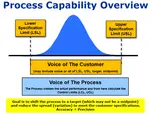
In control doesn't necessarily mean a happy customer!
Remember that even though a process may be in-control, that does NOT mean that the process is meeting the expectations from the customer. It only means the process is consistent.
The customer expectations are provided as the specifications. The customer specifications are the LSL and USL and sometimes they will provide a target (that isn't always in the middle of the LSL and USL).
For the process to be in-control AND meeting the customer specifications, the process control limits should be within the customer specification limits (or a least the amount which customer wants acceptable parts).
Several other non-Shewhart based control charts exist and most statistical software programs have these options.
The EWMA is one method that is commonly used for detecting smaller shifts quickly, less than or equal to 1.5 standard deviations. The data is also based on a normal distribution (same a I-MR and X-bar & R) but the process mean is not necessary a constant.
EWMA - Exponentially Weighted Moving Average
Most processes should benefit from SPC Charts whether it's for continuous or discrete data. Following these basic ground rules will ensure your customers will benefit, your audit scores will improve, your quality levels will improve, and a more stable business overall. These are some of the leading indicators to long term profitability.
Templates, Tables, and Calculators
Project Acceleration Techniques
Return to Six-Sigma-Material Home Page
Oct 18, 21 09:32 AM
Sep 14, 21 09:19 AM
Aug 16, 21 01:25 PM
Six Sigma Modules
The following are available
Click Here
Green Belt Program (1,000+ Slides)
Basic Statistics
Cost of Quality
SPC
Process Mapping
Capability Studies
MSA
Cause & Effect Matrix
FMEA
Multivariate Analysis
Central Limit Theorem
Confidence Intervals
Hypothesis Testing
T Tests
1-Way ANOVA
Chi-Square
Correlation and Regression
Control Plan
Kaizen
MTBF and MTTR
Project Pitfalls
Error Proofing
Effective Meetings
OEE
Takt Time
Line Balancing
Practice Exam
... and more