|

 content.")
Fishbone Diagram
(Ishikawa Diagram or Cause & Effect Diagram)
Description:
The Fishbone Diagram was originally created by Kaoru Ishikawa to find process imperfections (Ishakawa, 1985). The first company to adopt the diagram in all of its processes was Kawasaki Iron Fukiai Works in 1952. In 1962 Dr. Juran honored Ishikawa by naming the tool after him and is now also known as the Ishikawa Diagram. Its shape has earned the nickname of the Fishbone Diagram. This is one of the most commonly used tools of continuous improvement programs and is one of the 7 Basic Quality Tools bundled together by Ishikawa.
In a DMAIC Six Sigma project this tool is used in the MEASURE phase. It initiates the collection of the all root causes, x’s, or inputs that contribute to the problem, also referred to as the effect or "Y". Often this beginning phase of subjective root cause analysis runs concurrently with the Measurement Systems Analysis (MSA).
Objective:
To begin the process of finding and documenting the inputs to the problem from the obvious to the hidden causes. Some will be subjective and generated from brainstorming discussions and some will be shown by data, facts, and charts such as Pareto Diagrams. The linkage of the Fishbone Diagram to other tools is shown below.

This identification of these inputs requires a well-represented and engaged team, this is where the substance of the work begins to improve the process, product, or service.
The name Fishbone Diagram comes from the configuration of the diagram. The project problem or gap, "Y", as the head of the fish and the bones are the primary cause categories.
Categorizing the major causes helps the team focus their thoughts around one major input area at a time to identify root causes.
Some inputs have their own "causes" and these become “bones” branching off the larger bones, and this may go on two or three levels. Eventually, the root causes should be the smallest bones on the skeleton. The appearance of the diagram isn't as important as capturing all the inputs. The categories normally found in a manufacturing environment are:
1) Measurement – root causes from measurement devices
2) Manpower – root causes from people involved directly or indirectly
3) Machine – root causes from machine(s) involved
4) Method – root causes from the procedure used or done
5) Material – root causes from direct or indirect materials used
6) Environment – root causes from surroundings

The idea is to have the team concentrate on one major category at a time instead trying to brainstorm all the sources of variation and contributors at one time.
For example, start the exercise with them in the category of MACHINE and determine the input(s) that are related to MACHINE(S) that contribute to the variation in the OUTPUT (Y).
To help the team with the root cause determination the 5-WHY format can be applied.

It is not so important under which category each input is listed as long as it is identified and put on the list for further analysis. Do not get caught up on which category to list an input under when it is debatable, it is more important that the input has been captured.
After all of the inputs are listed, each one should be identified as either:
- N – noise, not controllable by the team (such as outdoor humidity)
- C – controllable input (such as processing temperature)
At the end of this exercise, all inputs, x’s, should be identified and labeled as "C" or "N".
A Fishbone Diagram should be done for each major process step and other project y's.
Example Fishbone Diagram
A project may have a goal to improve the production rate (such as higher pieces/minute of acceptable pieces) of a machine.
The team is focused on two elements of OEE,
- Availability
- Performance
since the Quality is already known to be acceptable.
However, data is scarce, not reliable, and will be difficult to get much meaningful data in a short amount of time. Therefore, the team will rely heavily on the sub
In this case many inputs occur to both "Y's but there will be many inputs that must be identified that will only apply to one or another.
A Fishbone Diagram is done for the "Y" of Availability and a "Y" of Performance. The team's goal is to determine all the inputs "x's" that affect each "Y" on a separate fishbone Diagram.
It is not important to weigh these inputs at this time, more importantly get all inputs documented and keep opinions and judgments from interfering.
The figure below shows the Fishbone Diagram related to the inputs that impact the Performance
 variable.
In this case, the Six Sigma team is trying to improve the Performance aspect within OEE.") Example of a Fishbone Diagram
Example of a Fishbone DiagramThe team also completed one for Availability. The next step is to funnel down these inputs (Process Input Variables or PIV's or x's) to start identifying the Key PIV's or KPIV's.
The next screening tool is called the Cause & Effect Matrix (sometimes call the Prioritization Matrix or Correlation Matrix). You can see the result of that exercise on the right side.
The team decided to take the top nine scores from the C&E Matrix and move them to the FMEA and assess a RPN score for each one.

What's Next?
The next tool called a Prioritization Matrix (PM) which is also sometimes called a Cause & Effect Matrix or Correlation Matrix will start the screening process (aka the funneling process) to filter out the trivial inputs.
Duplicates x's are removed from the Fishbone Diagram and the remaining Controllable inputs are inserted into a Prioritization Matrix (PM).
CAUTION: There could be 10-20 or there could be hundreds. Be careful how many are transferred to the PM because each input is weighed (scored by the team) in the PM phase and a lot of inputs could take a lot of time to score.
The PM assigns numbers to each input and attempts to objectively score each "cause". That score represents its impact on the Effect (Y).
The higher the score relative to the other scores, the greater the impact that cause (x) has on the Effect (Y). Once all the inputs are scored, the scores are sorted from highest to lowest and the highest scores are transferred to the FMEA.
The team has to make a decision on where that cut-off point is since not all inputs should be transferred to the FMEA. After all, the Fishbone and PM are screening tools - they are meant reduce the focus onto the vital causes on the Effect (Y).
You can't work on everything. There could be a valid case for every input but the intent is to focus on a few to get the most impact on the Y.
.")
Creating a Fishbone Diagram with Minitab
This is a screenshot showing the path to create your diagram using Minitab. Simply enter the inputs under the categories (causes) and a diagram is automatically generated. It allows you to change the labels, add titles, and resizes your diagram if inputs are added or removed as iterations are done.

Video of a Fishbone Diagram
|
|
|
Didn't find what you were looking for?
Try the Six Sigma Material search engine
The Six-Sigma-Material.com search engine below can be used to locate various topics of interest and other Six Sigma material on this site.

Proceed to next step of screening process: PRIORITIZATION MATRIX
Templates, Statistics Tables, and Calculators
Return to Six-Sigma-Material Home Page

.%20Y%20%3D%20the%20OUTPUT%20and%20all%20the%20fishbones%20represent%20the%20INPUTS.%20The%20goal%20is%20to%20first%20identify%20all%20the%20inputs%20that%20have%20an%20impact%20on%20the%20output.%20%0A%0A%23fishbone%20%23qualitycontrol%20%23sixsigma)
Ishikawa, K. (1985). What Is Total Quality Control? The Japanese Way. Englewood Cliffs, N.J.: Prentice-Hall, Inc. (original was published by JUSE Press, this is the English translated edition by Lu, David. J.)
Recent Articles
-
Process Capability Indices
Oct 18, 21 09:32 AM
 Determing the process capability indices, Pp, Ppk, Cp, Cpk, Cpm
 -
Six Sigma Calculator, Statistics Tables, and Six Sigma Templates
Sep 14, 21 09:19 AM
 Six Sigma Calculators, Statistics Tables, and Six Sigma Templates to make your job easier as a Six Sigma Project Manager
 -
Six Sigma Templates, Statistics Tables, and Six Sigma Calculators
Aug 16, 21 01:25 PM
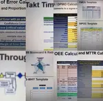
Six Sigma Templates, Tables, and Calculators. MTBF, MTTR, A3, EOQ, 5S, 5 WHY, DPMO, FMEA, SIPOC, RTY, DMAIC Contract, OEE, Value Stream Map, Pugh Matrix
Recent Articles
-
Process Capability Indices
Oct 18, 21 09:32 AM
Determing the process capability indices, Pp, Ppk, Cp, Cpk, Cpm -
Six Sigma Calculator, Statistics Tables, and Six Sigma Templates
Sep 14, 21 09:19 AM
Six Sigma Calculators, Statistics Tables, and Six Sigma Templates to make your job easier as a Six Sigma Project Manager -
Six Sigma Templates, Statistics Tables, and Six Sigma Calculators
Aug 16, 21 01:25 PM
Six Sigma Templates, Tables, and Calculators. MTBF, MTTR, A3, EOQ, 5S, 5 WHY, DPMO, FMEA, SIPOC, RTY, DMAIC Contract, OEE, Value Stream Map, Pugh Matrix -
Six Sigma, Six Sigma Training, Courses, Calculators, Certification
Aug 15, 21 10:27 PM
 One site with the most common Six Sigma material, videos, examples, calculators, courses, and certification.
Site Membership
LEARN MORE
Six Sigma
Templates, Tables & Calculators
Six Sigma Slides
Green Belt Program (1,000+ Slides)
Basic Statistics
Cost of Quality
SPC
Control Charts
Process Mapping
Capability Studies
MSA
SIPOC
Cause & Effect Matrix
FMEA
Multivariate Analysis
Central Limit Theorem
Confidence Intervals
Hypothesis Testing
Normality
T Tests
1-Way ANOVA
Chi-Square
Correlation
Regression
Control Plan
Kaizen
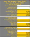
MTBF and MTTR
Project Pitfalls
Error Proofing
Z Scores
OEE
Takt Time
Line Balancing
Yield Metrics
Sampling Methods
Data Classification
Practice Exam
... and more