|

 content.")
Xbar R Chart
Xbar R charts are often used collectively to plot the process mean (Xbar) and process range (R) over time for continuous data. This control chart, along with I-MR and X-bar & S, are used in measuring statistical process control and assessing the stability of a process.
The R chart is used to review the process variation which must be in control to correctly interpret the Xbar chart. The control limits of the Xbar chart are calculated with the inputs of the process spread and mean. If the R chart is out of control, then the control limits on the X-bar chart may be inaccurate and exhibit Type I or II error.
There are a few commonly used charts to assess process control
These charts are used to verify process control before assessing capability such as Cpk, Ppk, Cp, Pp, or Cpm.
The Xbar chart plots the mean of the each subgroup. The I-MR chart obviously only has one observation point for each "group", or data point, so the plot is each point itself.
The R chart plots the range of the subgroups and is applied to assess whether the variation from subgroup to subgroup is in control.
Xbar-R charts are recommended over I-MR charts primarily due to containing more data (which strengthens a decision). Each data point has >1 observation record and this helps to identify true anomalies or capture a longer term representation of each data point.
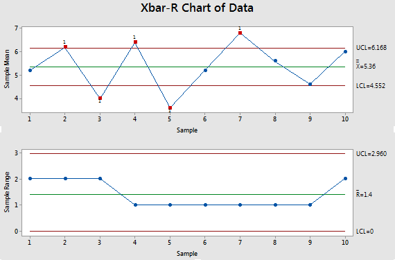
Example One
The Xbar chart below shows an out-of-control process. The R chart appears to be in control.
Statistical software will normally have the ability to test for conditions that indicate process control or the lack thereof.
Each data point is the mean of a subgroup of 5 observations. In total, 50 observations were recorded. Each of the 10 data points has 5 observations within it.
Recall, that not all out of control conditions are this obvious. Some conditions of special cause can occur within the LCL and UCL (control limits). There are Nelson Tests, Western Electric Tests and often times you can adjust them to create your own conditions to test for process control.
The following process cannot be assessed for capability. The R chart is in control and therefore the control limits on the Xbar chart are accurate and an assessment can be made on the process center. However, since there are failed tests in the Xbar chart, there is a nonrandom or special cause variation present within the process and require additional investigation.
A possible problem is the lack of measurement discrimination (aka granularity or resolution). The range chart points to the possibility that not enough decimals were used or more resolution should have been documented. It is not likely a natural process will perform exactly this consistently.
In other words, the range from subgroups in data point 1,2,3, and 10 was 2.0 exactly. Furthermore, the range of each subgroup in 4-9 was exactly 1.0.
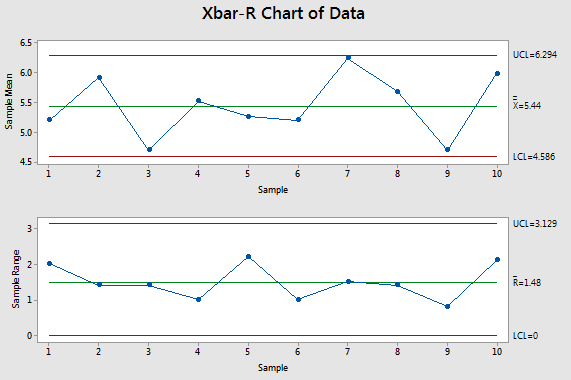
The Xbar-R charts below show a process that also has a subgroup size of 5 and again with 50 total observations among the 10 data points.
Notice the R chart appears to be more realistic too. The range within each subgroup is close but not exactly the same.
From this, it is possible to estimate the process capability (Cpk, Cp, Ppk, Pp, Cpm).
CONTINUOUS DATA:
The three charts above are used when plotting continuous data. Determine whether the data is in INDIVIDUALS or SUBGROUPS.
INDIVIDUALS
Each measurement is free from a rational subgrouping. Each measurement is taken as time progresses and can have its own set of circumstances.
SUBGROUPS
Each subgroup contains data of a similar short-term setting (one lot, one shift, one operator).
Easier analysis of subgroup data is done when the amounts of measurements per subgroup are equal. For example, if you are studying the MPG of a car at various speeds, collect the same amount of data points for each interval of speed.
However, this isn't a requirement for most statistical software programs. Use caution when classifying subgroups in the statistical software. Align the data set by subgroups and input the correct sample size of the subgroup as the software needs.
For subgroups <=8, use the range to estimate process variation: X-bar, R. For example, if appraisers are measuring parts every 30 minutes and they sample and measure 6 consecutive parts each 30-minute interval then the subgroup size is 6 and the range should be used to estimate the process variation.
For subgroups >8, use the standard deviation to estimate variation: X-bar, S. Using the above example; however, every 30 minutes the appraisers are sampling and measuring 15 consecutive parts then the subgroup size is 15 and the standard deviation becomes a better choice to estimate the process variation.
In the above examples, it is the subgroup size that matters, not the total amount of subgroups collected. You can collect as many subgroups as needed...within reason.
Why is rational subgrouping important?
These represent small samples within the population that are obtained at similar settings (inputs or condition) over short period of time. In other words, instead of getting one data point on a short-term setting, obtain 4-5 points and get a subgroup at that same setting and then move onto the next. This helps estimate the natural and common cause variation within the process.
Individuals type of data (I-MR) is acceptable to measure control; however, it usually means that more data points (longer period of time) are necessary to ensure all the true process variation is captured.
Sometimes this can be purposely controlled and other times you may have to recognize it within data. Sometimes a Six Sigma Project Manager will be given data without any idea on how it was collected. The Six Sigma Project Manager needs to take the time and review the source, sampling method, and determine those details before using the data to run hypothesis tests and draw conclusions.
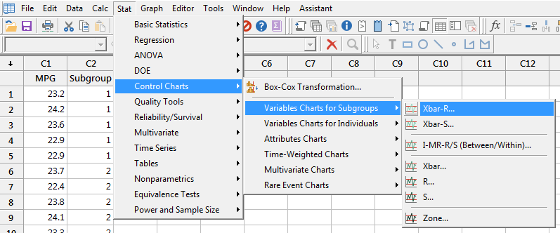
Using Minitab
As revisions are released the menu's may change from that shown below however, the general path is likely to remain similar.
Example Two
Using the data set in Excel in the .zip file below, copy and paste the information into statistical software and the following charts are generated. The data and results is also shown at the bottom of this page in a picture format.
 |
There are a total of 50 observations. Each subgroup has 5 observations creating a total of 10 data points. Both charts are in control which usually indicates that there are no special causes of variation, only common, natural, inherent process variation. |
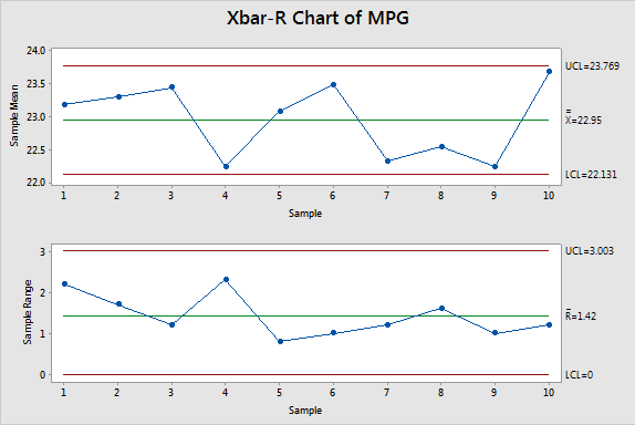
Xbar Chart Results
Notice the first data point in the Xbar chart is the mean of the first subgroup.
The data points are:
The mean of the first subgroup of 23.2, 24.2, 23.6, 22.9, 22.0 = 23.18
The centerline represents the average of all the 10 subgroup averages = 22.95
The Upper Control Limit (UCL) = 3 sigma above the center line = 23.769
The Lower Control Limit (LCL) = 3 sigma below the center line = 22.131
R Chart Results
The R chart is the control chart for the subgroup ranges. This chart must exhibit control in order to make conclusions on the Xbar chart. The UCL and LCL on the Xbar chart are calculated with inputs related to process centering and spread (variation).
Once the R chart exhibits control (such as the above chart), then an out-of-control condition on the Xbar chart is a result of changes in the process center.
The first data point is the difference in the maximum and minimum of the 5 observations in the first subgroup of 23.2, 24.2, 23.6, 22.9, 22.0.
The maximum value is 24.2 and the minimum is 22.0 with range = 2.20
The Rbar value represents the average of all 10 subgroup ranges = 1.42
The data set below was used in Example Two with subgroup averages and the range shown for each subgroup.

Xbar-R Chart in Excel

Return to the Six-Sigma-Material.com Home page
Recent Articles
-
Process Capability Indices
Oct 18, 21 09:32 AM
 Determing the process capability indices, Pp, Ppk, Cp, Cpk, Cpm
 -
Six Sigma Calculator, Statistics Tables, and Six Sigma Templates
Sep 14, 21 09:19 AM
 Six Sigma Calculators, Statistics Tables, and Six Sigma Templates to make your job easier as a Six Sigma Project Manager
 -
Six Sigma Templates, Statistics Tables, and Six Sigma Calculators
Aug 16, 21 01:25 PM
Six Sigma Templates, Tables, and Calculators. MTBF, MTTR, A3, EOQ, 5S, 5 WHY, DPMO, FMEA, SIPOC, RTY, DMAIC Contract, OEE, Value Stream Map, Pugh Matrix
Recent Articles
-
Process Capability Indices
Oct 18, 21 09:32 AM
Determing the process capability indices, Pp, Ppk, Cp, Cpk, Cpm -
Six Sigma Calculator, Statistics Tables, and Six Sigma Templates
Sep 14, 21 09:19 AM
Six Sigma Calculators, Statistics Tables, and Six Sigma Templates to make your job easier as a Six Sigma Project Manager -
Six Sigma Templates, Statistics Tables, and Six Sigma Calculators
Aug 16, 21 01:25 PM
Six Sigma Templates, Tables, and Calculators. MTBF, MTTR, A3, EOQ, 5S, 5 WHY, DPMO, FMEA, SIPOC, RTY, DMAIC Contract, OEE, Value Stream Map, Pugh Matrix -
Six Sigma, Six Sigma Training, Courses, Calculators, Certification
Aug 15, 21 10:27 PM
 One site with the most common Six Sigma material, videos, examples, calculators, courses, and certification.

Site Membership
LEARN MORE
Six Sigma
Templates, Tables & Calculators
Six Sigma Slides
Green Belt Program (1,000+ Slides)
Basic Statistics
Cost of Quality
SPC
Control Charts
Process Mapping
Capability Studies
MSA
SIPOC
Cause & Effect Matrix
FMEA
Multivariate Analysis
Central Limit Theorem
Confidence Intervals
Hypothesis Testing
Normality
T Tests
1-Way ANOVA
Chi-Square
Correlation
Regression
Control Plan
Kaizen
MTBF and MTTR
Project Pitfalls
Error Proofing
Z Scores
OEE
Takt Time
Line Balancing
Yield Metrics
Sampling Methods
Data Classification
Practice Exam
... and more