|

 content.")

I-MR Charts
Individuals - Moving Range Charts
I-MR charts plot individual observations on one chart accompanied with another chart of the range of the individual observations - normally from each consecutive data point. This chart is used to plot CONTINUOUS data.
The Individuals (I) Chart plots each measurement (sometimes called an observation) as a separate data point. Each data point stands on its own and the means there is no rational subgrouping and the subgroup size = 1.
A couple other common charts used with subgroups >1 are:
A typical Moving Range (MR) Chart uses a default value of 2, which means each data point plots the difference (range) between two consecutive data points as they come from the process in sequential order. Therefore there will be one less data point in the MR chart than the Individuals chart. However, this value is adjustable in most statistical software programs.
I-MR charts should be in control according the control tests that you elect to use. There are many types of tests that can determine control and points within the control limits can also be out of control or special cause.
Example One of an I-MR Chart
The data below of measurements were taken from the overall length of 30 different widgets.
The calculation applies the short-term estimate with un-biasing constant since it is most likely a sampling representing the short term performance of the process. Keep in mind there are several estimates for sigma (standard deviation) and each use should be agreed upon with the customer and the reasoning for its selection.

The first data point in the RANGE chart since a moving range of 2 was selected = the absolute value (or the positive difference) of 5.77 - 4.57 = 1.20.
NOTE
- One measurement per part, with no rational subgroups.
- Parts are measured in order from which they came from the process.
- There is one less "range" data point than parts measured.
- Using MR-bar/d2 for estimate of sigma (short term estimate for standard deviation).

Both charts indicate a process that is stable and in control. This would suffice for the stability portion of an MSA.
If this were the new (AFTER) data from a process improvement and this performance is better and more desirable than the BEFORE performance, then these control limits could be set as the new process control limits.
If this were the previous (BEFORE) data of a process, and all the variation is explained by common cause inherent variation then it will take a fundamental change (hopefully an improvement) to change and sustain this performance.
The objective of the team is to eliminate or explain all special cause variation and make fundamental, unprecedented improvements to drive the existing level of common cause performance to a reduced variation and more precise performance around a target.
Example Two
BEFORE & AFTER I-MR Chart
Below is an example of data compiled at the end of the IMPROVE phase from a time study before and after the improvements were implemented on an inspection process. The times were charted with each time representing its own group (subgroup size = 1). Time is an continuous data type that would you an SPC chart such as an I-MR.
You can see from the chart the average for the individual measurement times went down to 9.79 minutes and, by examining the lower chart, you can see the variation among the times also was reduced.
To statistically analyze whether the mean has changed you could use the 2 sample-t test or paired-t test (depending on the data and assuming the data is normally distributed).

Hypothesis Test
Using the data in the above chart, a 2 sample t-test was done with alpha risk set at 0.05 to determine if there is a significant difference in the performance of the mean BEFORE and AFTER.
NOTE: Although 52 samples were taken in both BEFORE and AFTER, the pairs are not matched due to different parts being assessed and being a destructive study. Had the assessment been done using the same parts and non-destructive parts then the paired t test should be used.
Null hypothesis Ho: Mean BEFORE = Mean AFTER
Alternative hypothesis HA: Mean AFTER < Mean BEFORE
This creates a one-tailed test.
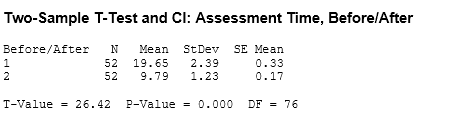
The null hypothesis is rejected. There are a couple ways to conclude this.
The test statistic of 26.42 is greater than critical t-value at 0.05, and dF = 76 which is 1.67 for one tailed test. dF = Degrees of Freedom
and
the p-value being less than 0.05.
With the statistical evidence that a shift has occurred in the mean from 19.65 minutes to 9.79 minutes.
The AFTER performance also passed all SPC tests so the new control limits should be used going forward to monitor this process. This is an important part of the CONTROL phase and the Revised FMEA.
The Revised FMEA should document the new control limits for the process and this is done to quickly identify if the future process performance remains in control and is sustained.
Using the old upper and lower control limits to monitor a proven improved process is not likely expose any performance behavior that retracts or begins to fall back to old patterns. And, the goal is not to allow this, expose problems quickly and visibly so they can be addressed and get the process dialed in again.
Test for Variation reduction
To statistically check if the variation has changed from before, you could use the F-Test for Equal Variances.
Example:
Since this example is applying a 95% level of confidence, then any p-value < 0.05 would be statistically significant and you would reject the null hypothesis and conclude there is a difference.
VISUAL AID: Another visual guideline is to examine the confidence intervals shown in blue for the BEFORE (1) and AFTER (2) data.
IF the interval band lines DO overlap then there is no statistical difference between the variation before and after.
IF the interval band lines DO NOT overlap, there is a statistical significant difference between the variation before and after.
HINT:
The further the lines are away from overlapping the lower the p-value will be and more confidence you have in concluding there is a significant difference (seems obvious). If the edge of the lines were close to one another (such as the left edge of the top line and the right edge of the lower line in our example), then the p-value would be close to zero and the F-statistic would be about the same as the F-critical value.
 F-Test at Six-Sigma-Material.com
RECALL: The goal of most Six Sigma projects is to improve the mean to a target (add accuracy) and reduce variation (add precision).
Levene's test can be used on non-normal sets of data to test for Equal Variances.
With the new (AFTER) process in control, you can proceed to assess the final process capability and come up with the new z-score or use a capability index.
One-Way ANOVA
There is also an interest to determine if there is a significant difference between the four appraisers in the AFTER study. This could help identify one or more appraisers that could benefit from more training and examine where the new variation is coming from (within each operator, among, or both)
Using a One-Way ANOVA with alpha at 0.05, the following results of the AFTER data were generated.
Reminder there were 52 readings so dF = 51.
Click here to learn more about Degrees of Freedom.
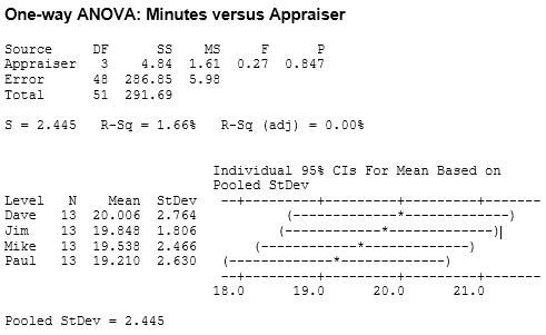
It is concluded there was not a statistical difference between the operators.
There are several things that support the conclusions.
- The p-value well above 0.05 (in other words, do not reject the null hypothesis)
- F-statistic < F-critical value of 2.81
- Heavily overlapping confidence intervals. Jim and Dave had almost the exact same results. The difference between Paul and Dave is the greatest but still not statistically significant at an alpha-risk of 0.05.
are all evidence that there is no difference among any pairs or combinations of them.
The low F-value of 0.27 says the variation within the appraisers is greater than the variation among them and not within the rejection region.
Templates, Tables, and Calculators
Return to the Six-Sigma-Material Home Page
Recent Articles
-
Process Capability Indices
Oct 18, 21 09:32 AM
 Determing the process capability indices, Pp, Ppk, Cp, Cpk, Cpm
 -
Six Sigma Calculator, Statistics Tables, and Six Sigma Templates
Sep 14, 21 09:19 AM
 Six Sigma Calculators, Statistics Tables, and Six Sigma Templates to make your job easier as a Six Sigma Project Manager
 -
Six Sigma Templates, Statistics Tables, and Six Sigma Calculators
Aug 16, 21 01:25 PM
Six Sigma Templates, Tables, and Calculators. MTBF, MTTR, A3, EOQ, 5S, 5 WHY, DPMO, FMEA, SIPOC, RTY, DMAIC Contract, OEE, Value Stream Map, Pugh Matrix -
Six Sigma, Six Sigma Training, Courses, Calculators, Certification
Aug 15, 21 10:27 PM
 One site with the most common Six Sigma material, videos, examples, calculators, courses, and certification.

Site Membership
LEARN MORE
Six Sigma
Templates, Tables & Calculators
Six Sigma Slides
Green Belt Program (1,000+ Slides)
Basic Statistics
Cost of Quality
SPC
Control Charts
Process Mapping
Capability Studies
MSA
SIPOC
Cause & Effect Matrix
FMEA
Multivariate Analysis
Central Limit Theorem
Confidence Intervals
Hypothesis Testing
Normality
T Tests
1-Way ANOVA
Chi-Square
Correlation
Regression
Control Plan
Kaizen
MTBF and MTTR
Project Pitfalls
Error Proofing
Z Scores
OEE
Takt Time
Line Balancing
Yield Metrics
Sampling Methods
Data Classification
Practice Exam
... and more