|

 content.")
Scatter Diagram
Scatter Diagrams (or Plots) are used to visually represent data for further analysis in correlation or regression. The diagram shows a pair of numerical data, one for each axis (horizontal and vertical with are x-y respectively). It shows the relationship between 2 variables.
They explore associations between two variables and the "x" variable (input) is varied systematically and the "y" (output) is measured once the input changes. The intention is to visually examine trends or patterns of the input (x) onto the response in the experiment.
The chart below would indicate a weak negative linear correlation. From here the Coefficient of Correlation can be determined as well as best fit line to describe the behavior of the data.
 A possible negative correlation but not overly convincing
There are no assumptions of normality or sequence to use a Scatter Plot. Sequential plotting is required for a Time-Series plot (and for SPC). In other words, the data for Scatter Plots does not have to be in sequence or chronological order but this is required for SPC and Time-Series charts.
It is most useful when there is a lot of data in table and very difficult to tell if there is any type, and to what degree, of correlation.
As association of variables does not always imply cause. There could be other lurking variables affecting the measured "y" response.
A scatter plot of the blue dots shown below makes it very obvious that there is strong positive linear correlation but it does not provide any value other than a visual indication.
 showing a strong positive linear correlation.")

A Scatter diagram itself is limited in its use but is rather a starting point for further analysis of correlation and regression.
This is another one of the many visual tools (such as a Box Plot and Pareto Chart) that a Six Sigma project manager can use to help break down data into more meaningful terms.
Line charts are similar to Scatter Plots but contain lines connecting the data.

The chart above is an example of the value of the plot. Simply looking at a set of x-y data on a sheet would be a challenge to see this relationship. There appears to be a strong non-linear relationship with a few outliers within the range of 0-200 units.
Those outliers are concerning. There are only a few of them so it would be worthwhile understanding what happened in each case.
Another Example of Scatter Plot
Shown below is called a Marginal Plot (fancy Scatter) a (X variable - the input) which is the Machine Setting and how it affects the Energy Usage (Y variable - the output).
Youi can see the Box Plot of each the X and Y variable too. There are two valuable visual tools on one chart. A lot of quick insight can be seen with this plot.
You can quickly see the relationship is not linear. Two questions arise
1) What is the formula that best fits the data and is it statistically useful?
Knowing the formula that has a strong correlation to the data is very helpful to model other scenarios and find the machine setting that uses the least amount of energy.
Minitab has options to select Linear, Cubic, or Quadrative fit lines, predictive and confidence intervals and the correlation coefficient. That is covered in the Regression module
2) What is the optimal setting to use the lowest amount of energy? A quick observation of the plot shows it will be about 20. That is not so easy to see when you're looking at just the data in a table.
There is one outlier that should be investigated in case it is a faulty data point but it probably won't change the formula too much (depending on how precise you need the machine setting answer to be).

7 Basic Quality Tools
A Scatter Plot is considered 1 of 7 Basic Quality Tools for process improvement. The others are:
- Fishbone Diagram (Cause-Effect Diagram or Ishikawa Diagram)
- Check Sheet
- Control Chart
- Histogram
- Pareto Chart
- and Stratification
If you're considering a Six Sigma Certification exam or a PMP certification, memorize and understand the purpose of these 7 tools.
Templates, Tables, and Calculators
Practice certification problems
Recent Articles
-
Process Capability Indices
Oct 18, 21 09:32 AM
 Determing the process capability indices, Pp, Ppk, Cp, Cpk, Cpm
 -
Six Sigma Calculator, Statistics Tables, and Six Sigma Templates
Sep 14, 21 09:19 AM
 Six Sigma Calculators, Statistics Tables, and Six Sigma Templates to make your job easier as a Six Sigma Project Manager
 -
Six Sigma Templates, Statistics Tables, and Six Sigma Calculators
Aug 16, 21 01:25 PM
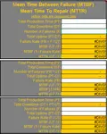
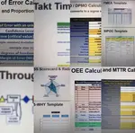
Six Sigma Templates, Tables, and Calculators. MTBF, MTTR, A3, EOQ, 5S, 5 WHY, DPMO, FMEA, SIPOC, RTY, DMAIC Contract, OEE, Value Stream Map, Pugh Matrix
Recent Articles
-
Process Capability Indices
Oct 18, 21 09:32 AM
Determing the process capability indices, Pp, Ppk, Cp, Cpk, Cpm -
Six Sigma Calculator, Statistics Tables, and Six Sigma Templates
Sep 14, 21 09:19 AM
Six Sigma Calculators, Statistics Tables, and Six Sigma Templates to make your job easier as a Six Sigma Project Manager -
Six Sigma Templates, Statistics Tables, and Six Sigma Calculators
Aug 16, 21 01:25 PM
Six Sigma Templates, Tables, and Calculators. MTBF, MTTR, A3, EOQ, 5S, 5 WHY, DPMO, FMEA, SIPOC, RTY, DMAIC Contract, OEE, Value Stream Map, Pugh Matrix -
Six Sigma, Six Sigma Training, Courses, Calculators, Certification
Aug 15, 21 10:27 PM
 One site with the most common Six Sigma material, videos, examples, calculators, courses, and certification.

Site Membership
LEARN MORE
Six Sigma
Templates, Tables & Calculators
Six Sigma Slides
Green Belt Program (1,000+ Slides)
Basic Statistics
Cost of Quality
SPC
Control Charts
Process Mapping
Capability Studies
MSA
SIPOC
Cause & Effect Matrix
FMEA
Multivariate Analysis
Central Limit Theorem
Confidence Intervals
Hypothesis Testing
Normality
T Tests
1-Way ANOVA
Chi-Square
Correlation
Regression
Control Plan
Kaizen
MTBF and MTTR
Project Pitfalls
Error Proofing
Z Scores
OEE
Takt Time
Line Balancing
Yield Metrics
Sampling Methods
Data Classification
Practice Exam
... and more