Pareto Diagram (Pareto Chart)
Description:
A Pareto Diagram was is derived from Italian economist (among other trades), Vilfredo Pareto, who came up with his Pareto principle. used to prioritize decisions to focus on the vital few instead of targeting all the categories.
The Pareto principle states that in many cases 20% of the categories often represents 80% of the opportunity. This chart is used frequently and will be one of the most necessary tools to learn. It is also used in several phases and can be used in all phases of the DMAIC process.
This is a chart (column or bar graph) where all categories are normally on the x-axis and add up to represent 100% accumulation of all the categories. The left vertical axis is the number of instances in category. The vertical column on the right is the percentage that category contains out of all the instances. There is also a line graph that are represents the cumulative total of the bars.
The objective is to illustrate the vital few and in our case, get the Six Sigma team to focus on the vital few rather than the trivial many, that make up the "20%".
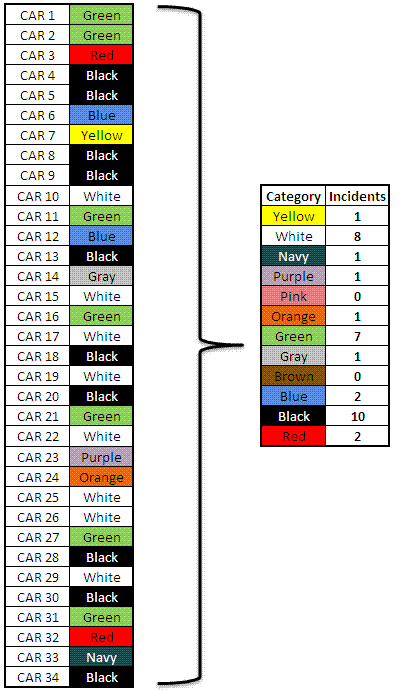
Below is an example of a study to find primary dominant colors of SUV's on the road. A random sampling of the first 34 SUV's were recorded in the table on the left side.
With clean data, creating a Pareto diagram should just take a few seconds. However, most often the data will need clean up and organization.
Learn to sort, filter, and use formulas in a data processing package is usually easier than attempting that work in the statistical software. Once familiar with these tips in a software package, it is just as easy to analyze a few data points as it is thousands.
Then, it is often as simple as pasting the data into the statistical software program and it takes care of the rest.
If you'd like assistance with this tool, feel free to contact us at sixsigmamaterial@gmail.comGarbage IN - Garbage OUT (GIGO)
Large amounts of data often require cleanup. Most common are spelling errors, decimal mislocation, extra zeros, spaces, dashes, typing of numbers errors (which can be hard to spot), etc. This affects sort and filter functions since they depend on exact replications and formats.
The data must be clean before running any type of chart or analysis.
For clarity, lets say 1 of the 10 BLACK observations was mistyped as BLCK. This will be analyzed as a separate category not knowing that it was meant to be BLACK. So BLCK will have a value of 1, and BLACK will have a value of 9.
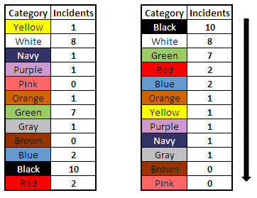
Sorting the data above by incident is not always required by a statistical software program but for clarity it is done here to show its relationship into a column graph.
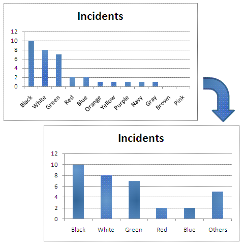
When there are many categories it may not be possible to view all of them and their values across the x-axis since there isn't enough room. Let's say you evaluated 100 different color of SUV's, it would take an very large graph to be able to read all the colors and values along the x-axis.
In order to simplify this and focus on the vital few which is the objective in the first place, the trivial many have their values summed up and put in a category called "OTHERS" and this is placed at the right side of the column graph.
These can not be eliminated from the data set and they play a role in the percentage and cumulative analysis of each color compared to entire data set.
Shown below are two single bar charts showing the same information in two formats. The one with the OTHERS category allow more visibility and readability on the vital few.
 Six-Sigma-Material.com
The add-on that a Pareto diagram has that a typical column chart does not is a cumulative line in the graph and numerical data on category contribution on the data set as individual and sum of the next.
The lower chart is missing the cumulative % line graph and % labels on the right side of the chart. Adding those would turn this into a Pareto Chart.
Examine the BLACK category. There are 10 findings out of the 34 total SUV's analyzed. Therefore BLACK SUV's made up 29.4 % of the total.
The top five colors made up 29 of the 34 analyzed, which is 85%.
The focus should be on those five colors, or perhaps just the top three colors
that are 74% of the total.
Creating a Pareto Chart in Excel
The 80/20 Principle
Adding up the top three categories, BLACK 10, WHITE 8, and GREEN 7, equals 25. So 25 of the 34 total observations are in the top three categories. This means 73.5% of the color were in 25% of the categories (there are 12 total categories or colors.
The Pareto principle suggests 80% / 20%, the above example is close to the 80 / 20 principle (73.5% / 27.5%).
Many statistical software programs will provide a final Pareto analysis that looks similar to these one below.
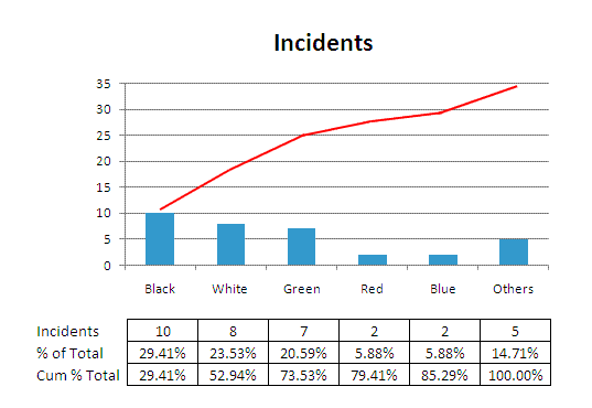 Pareto Diagram at Six-Sigma-Material.com
Sometimes there will be a second y-axis labeled on the right side of the graph that indicates the % contribution as a sum of the category values.
The red line sums the categories until it reaches 100%, notice the red line tops out at 34 since there are 34 total incidents.
Doing all of these calculations a couple times on your own will solidify the meaning and interpretation of these diagrams.
The output of the tool is getting the team to target their improvements on the most important categories, those on the left side of the chart with the highest or most instances.
With this example, the team may conclude that BLACK, WHITE and GREEN SUV's are in higher demand than others.
Moreover, as it will also be covered in the MEASURE phase, the data and the method of categorization must be accurate or this could provide misleading information. Sometimes, these diagrams are used to determine new projects and help write contracts with refined scopes.
Many software package can quickly generate Pareto diagrams with little difficulty. Understanding this diagram, the limitations, and interpreting this information is the job of the GB/BB for the team.
Pareto Diagram Example
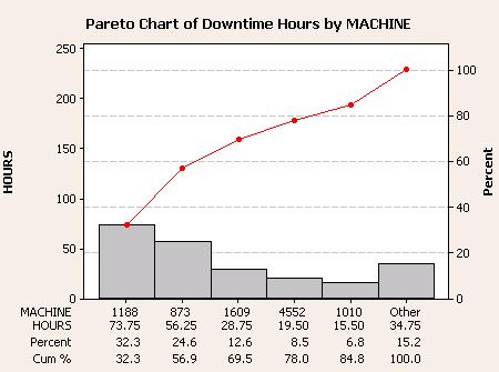
From the graph below there is a lot of information summarized into easy to decipher chart and clearly shows where the next level of analysis should be done.
It can be concluded that there are five machines that contribute >80% of the downtime. Machine numbers 1188 and 873 make up over 50% of the total downtime.
It may simply be because they run more than the others so their is more opportunity for downtime so this information can be misleading. In any case, downtime of any sort is still opportunity.
If machine-machine variation is found to be a key contributor after an ANOVA is done then this analysis can direct the team on which machine to focus on first.
Perhaps many of the improvements to one machine can be "looked across" to others that are the same type which adds quick success and high ease of completion to addressing root causes beyond the vital few.
From here, as a GB/BB, you should evaluate the variation between shifts, parts that run on each machines, operators and look for special cause issues.
In many cases your information may not surprise your team members especially if they are the operators and supervisors which they should have representation. The key is driving the team hard to find a strong solution that gets IMPLEMENTED.
Add strong mistake-proofing and make sure there are actual actions to get these items completed that are on the IMPROVE list. As a GB/BB your role is to remove obstacles from the team and offers ways to get the results the team thinks will reduce variation and optimize the mean.
Basic Tools of Quality
The Pareto Chart is considered 1 of the 7 Basic Tools of Quality:
- Check sheet
- Control chart
- Fishbone diagram
- Histogram
- Pareto chart
- Scatter diagram
- Stratification (sometimes this 7th is replaced with flow chart or a run chart)
Site Membership
Click for a Password
to access entire site
Six Sigma
Templates & Calculators
Six Sigma Modules
The following are available
Click Here
Green Belt Program (1,000+ Slides)
Basic Statistics
Cost of Quality
SPC
Process Mapping
Capability Studies
MSA
Cause & Effect Matrix
FMEA
Multivariate Analysis
Central Limit Theorem
Confidence Intervals
Hypothesis Testing
T Tests
1-Way ANOVA
Chi-Square
Correlation and Regression
Control Plan
Kaizen
MTBF and MTTR
Project Pitfalls
Error Proofing
Effective Meetings
OEE
Takt Time
Line Balancing
Practice Exam
... and more
