|

 content.")

Correlation
Correlation measures the relationship of the process inputs (x) on the output (y). It is the degree or extent of the relationship between two variables. These studies are used to examine if there is a predictive relationship of the input on the process.
Correlation and Regression studies are normally done together as part of the ANALYZE phase of a DMAIC project.
Couple notes:
- Predicting within the range of the data is called "interpolating"
- Predicting outside the range of the data is called "extrapolating".
Correlation studies and dependencies tend to be stronger with more data and the maximum range being applied (be aware this can also hide areas of correlation or unique relationships with subsets of the data).
However, visualization of the data set can also show that there may exist varying relationships within the range of samples. Within a smaller specific range there could be a relationship, and then another range could show a different relationship.

The picture to the left shows that there is very little, if any, correlation of the variables.
They are independent variables at least within the range of inputs studied and the "r" value is approximately zero.
A correlation value may be close to zero but closer review will indicate enlightening information. As mentioned earlier, be aware that sometimes too much data can hide relationships.
The point is to run the correlation visually and mathematically.
- "X" is considered the independent variable or predictor variable.
- "Y" is the dependent variable or predicted variable.
Regression and correlation involve testing a
relationship rather than testing of means or variances. They are used to find out the variables and to the degree the impact the response so that the team can control the key inputs. Controlling these key inputs is done to shift the mean and reduce variation of an overall Project "Y".
Linear Correlation
There are several correlation coefficients in use but the most frequently used is the Pearson Product Moment Correlation, also referred to as the Coefficient of Correlation (COC) that measures only a linear relationship between two variables and is denoted by an "r" value. The formula is shown below.
")
The "r" value is used to measure the linear correlation and it will always range from -1.0 (anticorrelation) to +1.0. As the value approaches 0 there is less linear correlation, or dependence, of the variables.
If the value:
- of one variable increases when the value of the other increases, they are said to be positively linearly correlated.
- of the output (y) decreases when the value of the input (x) increases, they are said to be negatively linearly correlated.
- of the output increases when as the input value increase then they are said to be positively correlated.
The degree of linear association between two variables is quantified by the COC.
Pearson's Correlation DOES NOT assume that the data is normally distributed but is strongly influenced by outliers anywhere in the data set. It is most accurate when the data sets are normally distributed.
As expected, an outlier is likely to take away from the linear association of the other non-outlying variables whether the association is negative or positive.
The data classification for each of the variables must be ratio or interval types and the relationship must be monotonic.
The "r" value represents a unitless translation of covariance, meaning the closer the
value is to +1, the closer the linear relationship is between the x and y
random variables.
As the value of "r" approaches zero from
either side, the correlation is weaker. That is the input, x, has a
lower correlation on the output, y.
This is normally shown by a
x-y plot referred to as a Scatter Graph. This graph shows all the data
points where the input, x, is varied systematically and the output, or
the effect, of y is measured.
- A "r" value of +1.0 indicates a perfect and strong POSITIVE correlation. There is a perfect direct relationship between X and Y,
- A "r" value of -1.0 indicates a perfect and strong NEGATIVE correlation or anticorrelation. There is a perfect inverse relationship between X and Y.
A
data set that does not have a slope (slope = 0) will have a correlation
coefficient that is undefined because the variance of Y is zero. In
other words, the output is not affected by any of the input values.

Shown below in the video is an example starting with a set of
data and progressive steps to manually calculate the LINEAR
correlation coefficient, "r".
This is a study between the number of caterpillars in a cabbage patch and the quantity of cabbages destroyed.
Non Linear Correlation
The picture below indicates a strong relationship that would not be evident by simply analyzing the "r" value. The "r" value is going to be close to zero which means the variables are independent. Recall, the "r" value is measure of linear association only.
There is another measurement that explains association. Visit Spearman's Rho Correlation Coefficient for an explanation of the monotonic association strength between two variables.
However,
when it comes to data similar to the picture below there is strong indication that an association exist but it is non-linear.
This module doesn't investigate non-linear mathematical relationships but it is
important to understand they exist as the picture below shows (which is
non-linear and non-monotonic).

More about COC and COD
What is the difference between the Coefficient of Correlation (COC) and Coefficient of Determination (COD)?
The COD ranges from 0-1 (0%-100%).
The COD is the proportion of variability of the dependent variable (Y) accounted for or explained by the independent variable (x) equal to the COC value squared.
In other words, it is the percentage of variation in Y explained by the linear relationship with X. or the ratio of the variation in the dependent variable explained by the regression to the total variation.
The COC is a value from -1 to +1 that describes the linear correlation of the dependent and independent variable. A value near zero indicates no linear relationship.
The sign is necessary to see if relationship is positive or negative so solving for COR by taking the square root of COD may not give the correct correlation since the sign can be positive or negative.
 and Coefficient of Determination (COD)")
CAUTION:
Correlation interpretations from data or graphs can be wrong if it is purely coincidental.
Regardless of how strong (positive or negative) it may appear, Correlation never implies causation. There could be other variables behind the one charted that could be a factor.
For
example, a chart or correlation value may indicate a strong
relationship (linear or non-linear) but in reality there may be no
relationship or dependency at all.
Just like most statistical results they must be reviewed subjectively with consideration of common sense. This is done with the Six Sigma team. The GB/BB is responsible for sharing the results in any way to help the team make the right decisions.
It
is possible to have the same "r" value and have several different
graphical representations, another reason to review the scatter plot and
"r" value together.
Practice Problems
Find r if the COD is 0.85?
From the information earlier, you can solve for r which equals the square root of the COD. Therefore the square root of 0.85 is 0.922 or -0.922.
Which of the statement(s) is/are true if the COD = 0.85?
1) 85% of the variation is explained by the regression model
2) The correlation can be positive or negative
Both responses are true.
Hypothesis Testing
Below is an example of monthly results of cereal sales related to marketing dollars. The intention is to determine the degree of linear correlation between marketing dollars spent to cereal sales. The data was compiled and is shown below.

Visually depicting the data is recommended whether is it time-series
charts, scatter plots, or box plots. This helps in seeing trends and
overall behavioral relationships between data. A couple graphs of the data are shown below. The scatter plot shows quickly that there appears to be a strong linear correlation.


Assessing the Correlation
Establish the Practical Problem
Is there a relationship between the amount of money dedicated to marketing to the sales of cereal and what is the strength of the relations?
Establish the Statistical Problem
Ho: Sales and Marketing dollars spent are not correlated
HA: Sales and Marketing dollars spent are correlated
Choose a Level of Significance
Alpha risk selected is 0.05
If the calculated p-value is <0.05, then the reject the Ho (null) and infer the Ha.
The sample size = 12
Using Minitab
Find Correlation from the pull-down menu and enter both continuous sets of data and use Pearson Correlation, then the results are shown.
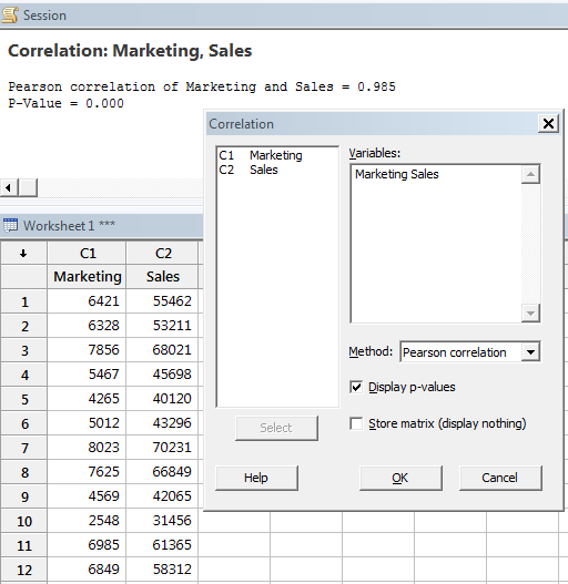
RESULT:
P value = 0.000
r = 0.9851 or 98.51%
With those results, reject the null and infer that there is a statistically significant correlation (which is the alternative hypothesis).
The linear correlation between the marketing dollars
spent and resulting cereal sales is strong within a given month. The
correlation coefficient (r) = 0.9851 within the inference range of
$2,548 to $8,023 marketing dollars analyzed. This is a strong positive
correlation. The more marketing, the higher the cereal sales.
Likely, at some point, that cereal sales would level off regardless of how high the amount of marketing dollars. That is why it is very important to keep your conclusion with the inference range.
Another method to perform the statistical evaluation is by comparing the r- calculated value of 0.9851 to the r-critical value.
The r-critical value for a sample size of 12 at alpha risk of 0.05 is 0.4973.
If the value of r-calculated is >0.4973, then there is a statistical significant correlation and in this example that is clearly the case.
Regression takes it a step further and develops a formula to describe the nature of the relationship. Visit the Regression module for more information.
CAUTION:
As indicated earlier, the scatter plot should be visually examined. Even if the correlation coefficient was very low (linear relationship) there may be a non-linear relationship such as cubic or quadratic that could be very strong.
Correlation Coefficient in Excel
Finding the Pearson Correlation
Coefficient of two sets of data is done in Excel as shown below. The
data does not have to be normally distributed but do have to be equal
sample sizes.
The Pearson Correlation Coefficient between these two sets of data is -0.2636, a weak negative correlation.

How does Correlation relate to Regression?
Recall that
Correlation indicates the amount of linear association that exists
between two variables in the form of a value between -1.0 to 1.0.
Such
as the linear correlation from earlier example where the value of
-0.2636 was found and indicates a negative correlation but it is not
very strong.
Regression provides an equation describing the nature of relationship such as y=mx+b.
There are various types of Regression:
Simple Linear Regression
Single regressor (x) variable such as x1 and model linear with respect to coefficients.
Multiple Linear Regression
Multiple regressor (x) variables such as x1, x2...xn and model linear with respect to coefficients.
Simple Non-Linear Regression
Single regressor (x) variable such as x and model non-linear with respect to coefficients.
Multiple Non-Linear Regression
Multiple regressor (x) variables such as x1, x2...xn and model nonlinear with respect to coefficients.
Correlation and Regression Download
 |
There of two module of slides that provide additional insight into Correlation and Regression. This is critical component of statistical analysis and can quickly provide answers about the inputs and their effect on the outputs. These tools are frequently used in the DMAIC journey. Click here to see the Correlation and Regression module and view others that are available. |
How does Correlation relate to Covariance?
While the Covariance indicates how well two variables move together, Correlation provides the strength of the variables and is a normalized version of Covariance. They both will always have the same sign: positive, negative, or 0.
Covariance is the numerator in the equation below therefore if the standard deviations of x and y are constant, as the Covariance increases, the Correlation also increases and approaches +1.0. Also, if the Covariance decreases, the Correlation decreases and approaches -1.0.
Correlation is a dimensionless value that will always be between -1.0 and +1.0, with 0 indicating the two variables move randomly from each other and are uncorrelated. Values closer to 0 (either negative or positive indicate weaker and weaker correlation.
As Covariance increases (also as Correlation values approach +1.0) this indicates a stronger and stronger positive relationship of the variables moving together. As Covariance decreases (also as correlation values approach -1.0) this indicates a stronger inverse relationship.
Values near zero for both parameters equates to no relationship or correlation and therefore those inputs or combination of inputs are not related to the output. This is valuable to the Six Sigma team so this input can be ruled out (unless it has a impact as in a combination with another input).
The following formula illustrates the relationship of the two terms. The formula below applies for sample and population calculations.
Return to BASIC STATISTICS
Return to the ANALYZE Phase
Templates, Tables, and Calculators
Search Six Sigma related job openings
Return to Six-Sigma-Material Home Page
Recent Articles
-
Process Capability Indices
Oct 18, 21 09:32 AM
 Determing the process capability indices, Pp, Ppk, Cp, Cpk, Cpm
 -
Six Sigma Calculator, Statistics Tables, and Six Sigma Templates
Sep 14, 21 09:19 AM
 Six Sigma Calculators, Statistics Tables, and Six Sigma Templates to make your job easier as a Six Sigma Project Manager
 -
Six Sigma Templates, Statistics Tables, and Six Sigma Calculators
Aug 16, 21 01:25 PM
Six Sigma Templates, Tables, and Calculators. MTBF, MTTR, A3, EOQ, 5S, 5 WHY, DPMO, FMEA, SIPOC, RTY, DMAIC Contract, OEE, Value Stream Map, Pugh Matrix -
Six Sigma, Six Sigma Training, Courses, Calculators, Certification
Aug 15, 21 10:27 PM
 One site with the most common Six Sigma material, videos, examples, calculators, courses, and certification.

Site Membership
LEARN MORE
Six Sigma
Templates, Tables & Calculators
Six Sigma Slides
Green Belt Program (1,000+ Slides)
Basic Statistics
Cost of Quality
SPC
Control Charts
Process Mapping
Capability Studies
MSA
SIPOC
Cause & Effect Matrix
FMEA
Multivariate Analysis
Central Limit Theorem
Confidence Intervals
Hypothesis Testing
Normality
T Tests
1-Way ANOVA
Chi-Square
Correlation
Regression
Control Plan
Kaizen
MTBF and MTTR
Project Pitfalls
Error Proofing
Z Scores
OEE
Takt Time
Line Balancing
Yield Metrics
Sampling Methods
Data Classification
Practice Exam
... and more