|
 content.")

Process Maps
Description:
A Process Map (aka Process Flow Chart) is a detailed flow diagram of the process using color coded symbols that drill further into the high-level map generated on the SIPOC.
The purpose is to visually represent the process as it is in reality. It's a map of the system.
Complete the current state map by walking (GEMBA walk) and experiencing the process. This is a valuable learning experience. The team will quickly gain insight about the actual flow. Avoid sitting in a room and think it through yourself or with the team. Patience, time, asking questions, interviewing people, are all a part of the completing this map.
Create a current state and a future state. Your team may want a future state with a short-term target (such as 90 days) and a long-term ideal state.
Objective:
To capture all the complexity and improvement opportunities by analyzing each step in detail. Seek out the 7-Wastes and enhance current value-added activities.
Levels of a Process Map

Look for:
- Automation Opportunities
- Material Handling
- Duplication
- Redundancy
- Decisions
- Delays
- Rework Loops
- Non Value-Added Steps vs. Value-Added Steps
These represent opportunity for waste elimination. Proceed with the goal to eliminate waste before settling for waste reduction. Throughout the entire process map, look for the 7-Wastes. So, before process mapping, educate the team on how to "see" waste.
Take caution when considering "automation" to take over manual processes. People are adaptable and much more flexible. Automation is fixed, constant, and often difficult to fix and maintain. In a JIT environment the decision to automate is advised with caution.
Types of Process Maps
There are a few different types of process maps.
Types of process maps
top-down, swimlane, spaghetti diagram, value-stream (includes high level of data)
1) Flow Chart or Block Diagram (such as the example above).
These begin a the "high-level" and grow as more detailed is learned by the team and become a "detailed flow chart process map"
2) Cross Functional Map or Swim Lane
Rearranges flow chart process steps into lanes of functions. Hand-offs are indicated and the process steps move left to right (on the map) as time progresses. Or the swim lanes could be vertical and the process steps move from the top to bottom as time progresses.
"Functions" could be Departments (such as Sales, HR, Legal, Operations, Finance, etc.) or they could be process steps such as Prepare, Mix, Heat, Test, Sort, Pack, and Ship.

3) Cross Resource Map
Further drill down into functions showing actual resource to resource hand offs.
There are more variations along with other names but what's most important is to get the process steps documented as they actually exist. A SIPOC is also a basic form of a process map. A Spaghetti Diagram is another type of process map. A Value Stream Map is a more detailed quantitative form of a process map.
Elements of a Process Map
The following list of are key elements of a process map. The current state map may lack some of these elements. More importantly, is to consider these elements in the creation of the future state map. It is meant to be reviewed and updated on a continuous basis. The more detail it contains, the better understanding you and the team will have of the true process and opportunities.
- It's considered a living document.
- There are clear START and FINISH steps. Clear bookends.
- A Process Map should have an overall Owner.
- Metrics defined to show the future state improvement.
- Ability to stand the test of time (new hires, people changing roles, etc.).
- Ability to be achievable and realistic.
- Clear connection points and hand-offs.
- Accommodate some of the what-if, or unique scenarios. Not all processes will follow a particular path all the time. Try to map the most common alternative paths and improve those too.
Peanut Butter & Jelly Process Map Example
A good process map gets the process from the 50,000 foot level to the ground level of the actual process.
The development of the map is a team effort and it will educate everyone on the reality of the process and most often how little of the total process is value added. Typically, there are obvious improvements that will be become evident while the mapping is being done.
It will not be perfect the first time through, add more detail as it evolves. It is important to remain with the Start and Finish boundaries set forth by the SIPOC in the DEFINE phase.
The team needs to begin identifying the value-added steps versus the non value-added steps and time. This realization is clearer during Value Stream Mapping (VSM) that adds more quantification to the steps.
Creating a future state or ideal state (while being realistic yet not too limited) will make it clear to the team that everything getting in the way is opportunity to improve. Laws, regulations, customer standards, past paradigms all need to be challenged because they change over time.
Creating a process map on a computer is common and many software programs exist that have symbols created. However, the first drafts are often very complex and frequently revised.
Create the real flow on paper and post it publicly for others to offer input and critique. It is very important to catch the rework loops, communication issues, decision delays, stops, starts, pick-ups, drop-offs, and other waste so the team fully understands the opportunities.
These hidden factory "what-if" and "sometimes" paths are important for everyone to document and understand. This knowledge will create better subjective decisions when assigning weights to the inputs using the subjective root cause analysis tools in the Measure phase.
Rework Loops
Rework loops are where defects and wasted time are occurring. The team should focus on preventing them, reducing their severity, and detecting them if they cannot be eliminated. These can be drawn on any type of more detailed process step. It's critical to find these and eliminate or reduce them from occurring.
Each time a product goes through a loop, an adjustment or correction is done. It is feedback that is considered the element that indicates the need for this adjustment.
Some products, or processes, may actually go through the rework path multiple times and the map does not illustrate this unless specially noted and discussed.
The picture below shows two Rework Loops. Rework loops have varying severity. The process map does not show the amount or cost of pieces scrapped or the amount or cost of pieces reworked. Use the yield calculations to get this data.
Often a Rolled Throughput Yield (RTY) is calculated to help quantify the scrap and rework through these loops and this does not always mean the lowest RTY is the worst financially or to the customer.
If one type of rework is more expensive or higher risk to the customer (such as a delayed delivery), then it may be a higher priority to improve. This is all going to shake out in the subjective root cause analysis tools and the inputs get funneled out to the most important, key process input variables (KPIV's).

Insurance companies will often use flowcharts to identify hazards or perils that could result in exposure. Flowcharts should also be used by the team to evaluate ideas to reduce these exposures, similar to reducing the severity, occurrence, and detection of an input within a FMEA.
Risk managers often use them along with questionnaires for employees, inspections, and statistical analysis of previous losses to establish premiums for the company. Have an internal Risk Manager sit on your team from your company may be another way to capture financial savings.
Through a careful and detailed inspection process the best overall risk assessment can be done. Process Maps can provide a lot of information in an easy-to-read format. They will be looking for potential problems that are a combination of hazards, perils, and exposures.
For example:
A Six Sigma team may be working to reduce the number of Recordable Injuries and Lost Time Injuries. Some improvements that may be implemented are alarm systems, sprinklers in new areas, facility-wide intercoms, and others that may also qualify your company for reduced property insurance premiums.
Create a Process Map in Excel
|
|
|
Value-Added vs. Non-Value Added
Theoretically, the perfect state of a value stream or flowchart is to have 100% of the steps adding value.
What does this mean?
Value-Added:
- Physical change in the product
- Customer is willing to pay for the step or service
- First time yield is 100% - done right the first time
There is some debate about compliance steps. Certain steps are done to meet compliance criteria such testing and documentation. There is usually opportunity to streamline this "regulatory" or "business-mandated" processes.
The team should review these and not simply accept that they are requirements. Challenge the process and rule, ensure that the rules have not changed and get evidence of the rule to validate. Perhaps, the current method has waste or even the requirement is not being met.
Non-Value-Added:
- Set-ups
- Preparation
- Meetings
- Any of the 7-Wastes
- Inspections (that are not business or regulatory requirements)
- Not necessary to add value to the product or service
- Customer is not willing to pay for the step
Go to VALUE STREAM MAPPING to learn more.
Process Mapping - Download
 |
This module provides lessons on how to use different types of process mapping tools to breakdown and understand your business processes. It also gives an insight of how the outputs from this tool can become critical inputs for the more advanced tools you may use through your DMAIC journey. |
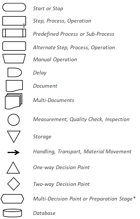
Flowchart Symbols
Different sources will use suggest different colors denotations for symbols. The color will help to identify specific steps when looking at very detailed maps. The color choice isn't critical, just use a consistent color scheme. There are numerous symbols, some of the most common are shown below.
Variations
Several other visual tools are forms of Process Maps and each has a specific use, is a part of another tool, or is a type of process map.
For example, the SIPOC is more than a very high-level process map, it defines the Suppliers, Inputs, Outputs, and Customers and its "Process Map" portion is very generic.
Some of these tools are:
-IDEF Modeling
-SIPOC (very high level)
-Deployment Flow Chart - (focuses on hand-off points)
-Value Stream Map (more quantitative but also has limitations)
-Activity Diagram (more detailed than the SIPOC)
-Detailed Process Map (most detailed "ground" level)
-Swim Lane Process Map
Templates, Tables, and Calculators
Search active job openings related to Six Sigma
Return to the Six-Sigma-Material Home Page
Recent Articles
-
Process Capability Indices
Oct 18, 21 09:32 AM
 Determing the process capability indices, Pp, Ppk, Cp, Cpk, Cpm
 -
Six Sigma Calculator, Statistics Tables, and Six Sigma Templates
Sep 14, 21 09:19 AM
 Six Sigma Calculators, Statistics Tables, and Six Sigma Templates to make your job easier as a Six Sigma Project Manager
 -
Six Sigma Templates, Statistics Tables, and Six Sigma Calculators
Aug 16, 21 01:25 PM
Six Sigma Templates, Tables, and Calculators. MTBF, MTTR, A3, EOQ, 5S, 5 WHY, DPMO, FMEA, SIPOC, RTY, DMAIC Contract, OEE, Value Stream Map, Pugh Matrix
Recent Articles
-
Process Capability Indices
Oct 18, 21 09:32 AM
Determing the process capability indices, Pp, Ppk, Cp, Cpk, Cpm -
Six Sigma Calculator, Statistics Tables, and Six Sigma Templates
Sep 14, 21 09:19 AM
Six Sigma Calculators, Statistics Tables, and Six Sigma Templates to make your job easier as a Six Sigma Project Manager -
Six Sigma Templates, Statistics Tables, and Six Sigma Calculators
Aug 16, 21 01:25 PM
Six Sigma Templates, Tables, and Calculators. MTBF, MTTR, A3, EOQ, 5S, 5 WHY, DPMO, FMEA, SIPOC, RTY, DMAIC Contract, OEE, Value Stream Map, Pugh Matrix -
Six Sigma, Six Sigma Training, Courses, Calculators, Certification
Aug 15, 21 10:27 PM
 One site with the most common Six Sigma material, videos, examples, calculators, courses, and certification.

Site Membership
LEARN MORE
Six Sigma
Templates, Tables & Calculators
Six Sigma Slides
Green Belt Program (1,000+ Slides)
Basic Statistics
Cost of Quality
SPC
Process Mapping
Capability Studies
MSA
SIPOC
Cause & Effect Matrix
FMEA
Multivariate Analysis
Central Limit Theorem
Confidence Intervals
Hypothesis Testing
T Tests
1-Way ANOVA
Chi-Square
Correlation
Regression
Control Plan
Kaizen
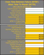
MTBF and MTTR
Project Pitfalls
Error Proofing
Z Scores
OEE
Takt Time
Line Balancing
Yield Metrics
Sampling Methods
Data Classification
Practice Exam
... and more
Statistics in Excel

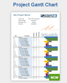
Need a Gantt Chart?