|

 content.")
Box Plot
Also called "box and whisker plots". Box Plots are used as graphical summaries depicting distributions. A histogram is more informative (used for plotting continuous data). By viewing the plots from the side, it's possible to visualize the histogram’s general shape.
Box Plots, histograms, and stem & leaf plots can depict the same data on a continuous scale.
Two variants from the commonly used fixed width box plot are the notched box plot and the other is the variable width box plot.
A sample result of a variable width box plot is shown below. The box plot shapes and spreads can provide quick general information on variation within and between categories. It may also indicate special cause or obvious areas of opportunity (outliers).

- The median (M or Q2) is shown as the center point (line) in the boxes but not necessarily the midpoint of the box itself. The median is the middle value of the data where half of the points are above and half are below this value.
- The first quartile (Q1) represents the point where 25% of the data are below it. It is represented by the line at the bottom of the box.
- The third quartile (Q3) represents the point where 75% of the data are below it. It is represented by the line at the top of the box.
- The whiskers extend up to the highest value of upper limit and down to the lowest value of the lower limit. The top of the upper whisker is the greatest value excluding outliers. The lowest point of the lower whicker is the lowest value excluding outliers.
- The lowest point of the lower whisker is called the lower limit. Lower limit value equals Q1 – 1.5 * (Q3-Q1).
- The highest point of the upper whisker is the called the upper limit. The upper limit value equals Q3 + 1.5 * (Q3-Q1).
- Outliers are points that fall outside the limits of the whiskers. These are normally recognized as asterisks and are points that are greater than 1.5x the interquartile distance from each quartile. Each point that qualifies will have an asterisk.
- The interquartile is represented by the distance between Q1 and Q3.
- The widths of the box plot indicate the size of the samples. The wider the box, the larger the sample. This is usually an option in statistical software programs, not all Box Plots have the widths proportional to the sample size.
One of the benefits of Box Plot is the quick visualization of any skewness and outliers. You'll want to investigate outliers to see if it is special cause, data entry error, or whether it can be removed. Perhaps the outlier(s) is related to a 1x event or measurement error and can be corrected or removed.
These outliers, and any skewness, can affect the validity of the p-value especially is the samples are small.
Box Plot Visual Aid

Example of a Box Plot
Let's breakdown this result. The figure below is showing the hours of set-up time by machine (four different machines) that set-up the same job repeatedly.
But not necessarily on the same shift, with the same operator, or the same raw material, same tooling - those are all potential input variables creating the variation you see below)
- Each machine had a least one outlier. It would be worth researching what happened in each case. Anything stand out that was different?
- Machine 35077 had the most variation in set-up times and had the highest mean set-up time. However, 35133 has the highest median.
- Machine 35070 and 35069 had similar variance and mean (red dots).
- Machine 35070 has the lowest median and mean.
In summary, nothing glaring stands out. The team should do a deeper dive into the inputs from other FOV's, such as operator, shift, materials, tools, etc. to find the inputs to control.

Box Plot of a Normal Distribution
Median = Mean = Mode in a normal distribution

Create a Box Plot in Excel
Click here to learn how to create a Box Plot in Excel.

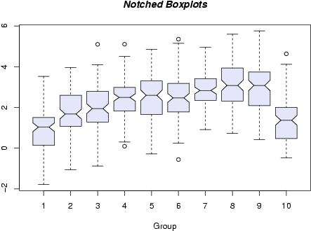
Notched Box Plot
The picture below is another variant of the Box-Plot from the (c)R Foundation found at http://www.r-project.org.
The R foundation provides free statistical software available as Free Software under the terms of the Free Software Foundation's GNU General Public License in source code form.
Notched box plots contain a narrowing of the box around the median. The line where the notches converge is still the median. Notches visually illustrate an estimate on whether there is a significant difference of medians. The width of the notches is proportional to the interquartile range of the sample.
It is still difficult to conclude there is or is not a difference between the medians in data set 6 and 7 but is it pretty clear that the median of groups 1 & 10 are different than 2-9.
Variable Width Box Plot
The other common variant that shows more information than the standard fixed width box plot is called the variable width box plot (like the plot at the top of this page).
However, this is only valuable if comparing more than one box plot since the width is irrelevant if displaying only one box plot.
One common convention is to make the width of the boxes for group of data proportional to the square roots of the number of observations in a given sample.
Search Six Sigma related job postings
Return to the Six-Sigma-Material Home Page
Recent Articles
-
Process Capability Indices
Oct 18, 21 09:32 AM
 Determing the process capability indices, Pp, Ppk, Cp, Cpk, Cpm
 -
Six Sigma Calculator, Statistics Tables, and Six Sigma Templates
Sep 14, 21 09:19 AM
 Six Sigma Calculators, Statistics Tables, and Six Sigma Templates to make your job easier as a Six Sigma Project Manager
 -
Six Sigma Templates, Statistics Tables, and Six Sigma Calculators
Aug 16, 21 01:25 PM
Six Sigma Templates, Tables, and Calculators. MTBF, MTTR, A3, EOQ, 5S, 5 WHY, DPMO, FMEA, SIPOC, RTY, DMAIC Contract, OEE, Value Stream Map, Pugh Matrix -
Six Sigma, Six Sigma Training, Courses, Calculators, Certification
Aug 15, 21 10:27 PM
 One site with the most common Six Sigma material, videos, examples, calculators, courses, and certification.

Site Membership
LEARN MORE
Six Sigma
Templates, Tables & Calculators
Six Sigma Slides
Green Belt Program (1,000+ Slides)
Basic Statistics
Cost of Quality
SPC
Control Charts
Process Mapping
Capability Studies
MSA
SIPOC
Cause & Effect Matrix
FMEA
Multivariate Analysis
Central Limit Theorem
Confidence Intervals
Hypothesis Testing
Normality
T Tests
1-Way ANOVA
Chi-Square
Correlation
Regression
Control Plan
Kaizen
MTBF and MTTR
Project Pitfalls
Error Proofing
Z Scores
OEE
Takt Time
Line Balancing
Yield Metrics
Sampling Methods
Data Classification
Practice Exam
... and more