|

 content.")

Skewness
Shape of the Distribution
Skewness describes the shape of the distribution along with another calculated value called kurtosis. Skewness is a measurement of symmetry where kurtosis is a measure of peakedness / flatness. Both are compared relative to the shape of a normal distribution.
The use of a histogram will give a quick visual indication of the skewness and kurtosis. A normal distribution has a skewness and kurtosis = 0 (Mesokurtic is the term for a kurtosis = 0).
If:
- Sk > 0, then skewed right distribution
- Sk = 0, then normal distribution
- Sk < 0, then skewed left distribution
Purpose
Most Six Sigma projects involve numerous statistical tests that depend on making the proper decision on the behavior (shape and location) of the data, in many cases....determining whether the data meets normality assumptions.
A visualization and calculation of kurtosis and skewness is used to help make that decision. It is one of many tools (others include the p-value or the fat-pencil tests) to determine whether a distribution is normal.
Most software programs perform these calculations but each has a specific formula that may be important to understand if you are weighing heavily on it to make a decision.
If your data doesn't meet the assumptions for normality, there are tools such as a Box-Cox transformation, log, square root of data to make a data set more normal and the apply the normality tests to the transformed data.
Coefficient of Skewness
There are a few equations to determine the skewness of a distribution. A couple of the most common formulas are explained below.
The following examples apply the data shown below

Excel and Minitab (Equation #1)
Fisher - Pearson Skewness
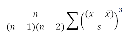
where:
n = number of samples
s = standard deviation
x = each observation or data point
x-bar = average
Data Set 1 in Minitab

Summary:
The skewness is positive at a value of 1.003 which indicates a right-skewed shape. The histogram and curve creates a visualization which shows the data is highly unlikely to meet the assumptions of normality.
The p-value also is further evidence being very low and most likely much less than the chosen alpha-risk (most often = 0.05).
The importance of graphing is illustrated in this example. Looking at the data alone as numbers does not easily depict the potential bi-modal behavior that the histogram is showing. This requires further investigation from the Six Sigma project manager.
On another note:
The kurtosis is negative which is another characterization of the data distribution shape. When the value is negative the shape is referred to as Platykurtic which indicates flatter distribution that normal bell curve.
Data Set 2 in Minitab
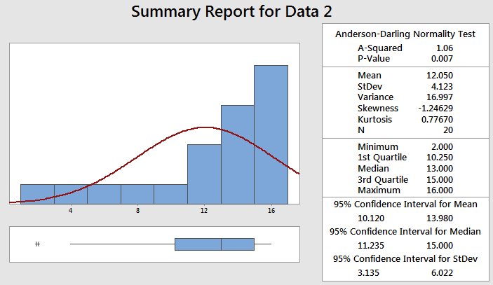
Summary:
The skewness is negative at a value of -1.246 which indicates a left-skewed shape. The histogram and curve creates a visualization which shows the data is highly unlikely to meet the assumptions of normality.
The p-value is also further evidence being very low and most likely much less than the chosen alpha-risk (most often = 0.05).
On another note:
The kurtosis is positive which is another characterization of the data distribution shape. When the value is positive the shape is called Leptokurtic which indicates peaked shaped distribution compared to normal bell curve.
Pearson 2
Karl Pearson is credited with developing the formula below to measure the Coefficient of Skewness. The formula compares the sample median with the standard deviation of the same distribution.

If:
Sk > 0 then skewed right distribution (positive skew)
Sk = 0 then normal distribution
Sk < 0 then skewed left distribution (negative skew)
Templates, Tables, and Calculators
Return to the Six-Sigma-Material.com Home Page
Recent Articles
-
Process Capability Indices
Oct 18, 21 09:32 AM
 Determing the process capability indices, Pp, Ppk, Cp, Cpk, Cpm
 -
Six Sigma Calculator, Statistics Tables, and Six Sigma Templates
Sep 14, 21 09:19 AM
 Six Sigma Calculators, Statistics Tables, and Six Sigma Templates to make your job easier as a Six Sigma Project Manager
 -
Six Sigma Templates, Statistics Tables, and Six Sigma Calculators
Aug 16, 21 01:25 PM
Six Sigma Templates, Tables, and Calculators. MTBF, MTTR, A3, EOQ, 5S, 5 WHY, DPMO, FMEA, SIPOC, RTY, DMAIC Contract, OEE, Value Stream Map, Pugh Matrix -
Six Sigma, Six Sigma Training, Courses, Calculators, Certification
Aug 15, 21 10:27 PM
 One site with the most common Six Sigma material, videos, examples, calculators, courses, and certification.

Site Membership
LEARN MORE
Six Sigma
Templates, Tables & Calculators
Six Sigma Slides
Green Belt Program (1,000+ Slides)
Basic Statistics
Cost of Quality
SPC
Control Charts
Process Mapping
Capability Studies
MSA
SIPOC
Cause & Effect Matrix
FMEA
Multivariate Analysis
Central Limit Theorem
Confidence Intervals
Hypothesis Testing
Normality
T Tests
1-Way ANOVA
Chi-Square
Correlation
Regression
Control Plan
Kaizen
MTBF and MTTR
Project Pitfalls
Error Proofing
Z Scores
OEE
Takt Time
Line Balancing
Yield Metrics
Sampling Methods
Data Classification
Practice Exam
... and more