|
 content.")

Activity Network Diagram
The Activity Network Diagram (aka Arrow Diagram) is a tool used by Project Managers to indicate the project activities and sequential relationships. The purpose is to identify the boundaries for the best case, worst case, and most likely project finish time (critical path). Moreover, to identify the critical path activities that have the most bearing on project completion.
This method includes PERT, CPM, Activity-On-Node Diagrams (AON), Precedence Diagrams (PDM), and other network diagrams.
Some tasks can occur simultaneously (in parallel) and others must take place only when other(s) are completed first (in series). Some activities may need to be only partially completed to allow another one to begin.
Example
A newer company is in the process of qualifying new direct material suppliers. There is some historical data available but some of the estimated timing is based on assumptions.
The Six Sigma Black Belt is tasked with creating the activity network diagram, and developing the best-case, most-likely, and worst-case lead times to approve new suppliers.
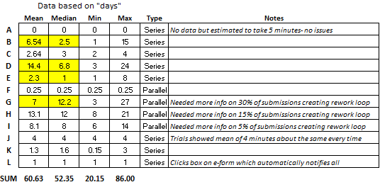
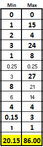
The company wants to implement a new target of establishing new suppliers with a mean <30 days and never to exceed 60 days. The general steps and data are shown below with the performance based on history, sample trials, or judgement.
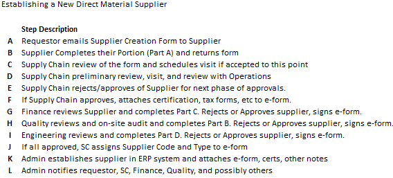

Notice that steps F, G, H, I can occur simultaneously but only after steps A, B, C, D, and E are complete in series (or sequential order). Then, once the four parallel steps are complete, Step J can begin. Then the last two steps are K and L in that order.
The results highlighted in YELLOW above are from non-normal data. We'll get to that in a minute.
Given the information provided in the table what are the takeaways?
The goal is achievable.
How do we know?
Notice the best-case scenarios of all the "series" event plus the longest "parallel" event took 20.15 days. It can be done if all the best cases are virtually repeatable, and variation is minimized.
But....that is a big "if" because there is a lot of variation and as "the most likely time" that is calculated later shows, there is work to do to shift the mean lower and get the variation under control.
Most of the time (given the current state) the process will not meet the goals with the worst-case being 86 days.
Highlighted in yellow, the data shows that there are outliers in some activities and most notably, within the rework loops during the Financial approval process, Step G.
Notice that there was at least one instance took 27 days, but it is possible to do this step in 3 days. There was possibly some back and forth discussion between Finance and the Supplier that should be investigated or a unique situation that caused the 27-day event.
A team should investigate this variation and start improvements here.

.)
Creating an Activity Network Diagram
1) Gather all activities and potential activities
The team may use an Affinity Diagram to list all the steps and post them in an organized manner and include some of the unusual or "what-if" situations that could impact the process. This tool works for more than processes. Use it whenever there are numerous ideas, steps, or possibilities, to help organize the thoughts.
It is most important to gather all the activities using whatever methods necessary. You can simplify later for create a simpler diagram but at least you learn more about the process. This is similar to the Process Mapping exercise.
Based on the information given, it appears there are some special cause situations that are creating a lot of variability and likely those are creating non-normal data and the measure of central tendency may not be the mean. So, it is very important to analyze the activities for those unique situations.
Perhaps, a few improvements on the "outliers" will be enough to reach the objective. Furthermore, the improvements made to some process (or machine, etc.) can be "read-across" or copied to other similar processes, operations and machines.
2) Create the Activity Network Diagram
The nodes (also called processes or steps) indicate the major steps involved within the entire activity. Similar to a process map, use arrows to connect the nodes to indicate the flow of the process.
When creating the diagram, draw activities that occur in series must be completed in sequential order as a series (one directly after the other).
Nodes that can occur simultaneously are shown as a parallel activity with others.
3) Create a spreadsheet (i.e. Excel) with the expected completion time for each node
You may indicate this timing with a range as shown above that illustrates there is clearly some data that is not normal and the median should be considered. Also, of value are the minimum (fastest case) and maximum (slowest case) for each step.
If data is not available, then the team or people with the most knowledge, will have to help provide the average, best-case, and worst-case for each step.
As a Project Manager, ask the tough questions about what creates challenges, what takes most time, the causes of delays and understand the sources of variation.
4) Identify the Critical Path
This careful review is the most important identification point that can come out of this exercise. When activities begin to branch out and go in parallel, it is key to identify which of them will take the longest or have highest variability in completion time.
The critical path is a line or path that encompasses the path of nodes that have the longest completion time. If using the mean, then that path could be different if considering the ranges from each node. A Project Manager should evaluate the critical path with some merit given to the nodes that have high risk of not preforming at the mean.
In other words, the mean may not be the appropriate measure to use for a node's completion time which is then used in the sum of all the project activity times. If the data is not normal, then the mode or median may be more appropriate.
Analyzing the data, when available, for this behavior takes a few seconds but can be very informational. This provides additional valuable insight for the team when targeting assessing risk and prioritizing improvements. It is the job of the Six Sigma GB/BB to identify this information for the team to digest.
Most importantly, determine which value will be used for the measure of central tendency. Once that is done, the critical path, best-case, worst-case, and most-likely cases can be determined.
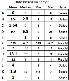
Take a close look at the Parallel steps of G, H, and I.
It makes a difference whether the mean or median is used to determine the level of risk that each step has in terms of completion time. In this case, use the mean for Step H of 13.1 days as having the most risk.
It is the constraint node of the parallel nodes. It is most likely to take the longest of the three so most attention needs to be devoted to ensure that it starts on time.
A close second place, is Step G (not Step I), since the median of 12.2 days and that is much greater than the mean of Step I. Therefore, it also needs to start on time because this step has taken up to 27 days which is the worst of all the steps.
Step I isn't as critical to start on time as long as it finishes at or before the others. However, notice that there was at least one time when it took 14 days so it does have some risk.
The critical path time (line) sums all the nodes in series at the mean (or median) plus the parallel node(s) with the longest expected completion time.
See the figure below and sum the days in bold which uses the median where the data was found to be non-normal.
The parallel node that has the longest measure of central tendency is Step H so only it is used along with the sum of the measures of central tendency from each of the series nodes. See the black line in the diagram above.
The critical path time is 32.34 days
5) Identify the most likely completion time
Nodes that run in series are straightforward. Use the node with the longest expected completion time when evaluating those that run in parallel.
For the most likely scenario, we will use the MEDIAN where that time is highlighted in yellow. The most likely time is shown by summing the days in bold.
Most-likely completion time is defined by the critical path: 32.34 days
So the most likely time is near the target of <30 days. This data shows that fixing this entire supplier creation process would be a good candidate for a DMAIC Six Sigma Project due to the variation that also need to be reduced and controlled.
6) Identify the best-case and worst-case times
The best-case is the sum of the shortest completion times. However, take the longest time of the minimum parallel activities. Because the best-case of the parallel nodes is only as good as the slowest link!
The best-case is 20.15 days
For the worst-case add the longest expected completion times of each the nodes summed together. If you are considering loops (such as rework), then at some point you'll have to draw the line and say that the process will go through without rework, or the worst-case time will approach infinity. The data above considers the rework in each data point to make up the mean, median, and range.
The worst-case is 86 days
In either case, document any assumptions or key specifics that are relevant to achieving the times. See the figure below for the MIN and MAX column. The sum of the bold numbers in each column represents the best-case and worst-case respectively.
NOTE: Some define the worst-case as the sum of only the activities in the critical path. That would result in an answer of 80 days. However, the data demonstrates that there is a possibility that Step G could be in the critical path so that is why the true worst case is 86 days.
The same applies for the best-case. If Step H (used for the critical path) would have had one instance where it was <6 days, then Step I would have been used in the best-case scenario since Step I would be the worst of the three parallel steps.
CAUTION:
These cases may not be as easy as adding all the lowest or highest of the ranges. Perhaps one activity takes lesser (or longer) time than if it follows another different proceeding activity.
Think each activity through and again, use the data when considering the ranges of each activity to help ensure the most optimistic time is understood clearly by all stakeholders.
If you have a specific activity that mirrors a historical scenario closely then it makes sense to review and weigh that timing closely. Perhaps this data includes are wide variety of unusual events or events that will not occur again (due to database change, etc.), then those need to be filtered out or at least considered in your decision.
Summary
Data analysis will provide the historical min, max, range, mean, mode, median, and standard deviation if needed. Then a normality assessment can be done to determine which measure of central tendency to apply.
Furthermore, if the data is in sequential order, it can be analyzed with SPC and you can evaluate trends to see if performance of activity is improving, stable, or getting worse. This provides more information, and it is quick to compute. This all helps in making the most accurate assessment of these times.
You could also put confidence intervals around certain steps where the data is available and add subject confidence intervals where data is not available. With that, you can add bands around the best-case, worst-case, critical path time, and most-likely time.
All of these measures are objective values to help develop the various estimated completion times.
NOTE:
The above module is more extensive than most Activity Network Diagrams that simply use an estimate and means to create timing estimates. However, for more accuracy and confidence in the numbers, follow this method without getting stuck by devoting too much time on data analysis (which is a Project Pitfall known as "Paralysis from Analysis").
Project Acceleration Techniques
Return to the Six-Sigma-Material.com Home page
Recent Articles
-
Process Capability Indices
Oct 18, 21 09:32 AM
 Determing the process capability indices, Pp, Ppk, Cp, Cpk, Cpm
 -
Six Sigma Calculator, Statistics Tables, and Six Sigma Templates
Sep 14, 21 09:19 AM
 Six Sigma Calculators, Statistics Tables, and Six Sigma Templates to make your job easier as a Six Sigma Project Manager
 -
Six Sigma Templates, Statistics Tables, and Six Sigma Calculators
Aug 16, 21 01:25 PM
Six Sigma Templates, Tables, and Calculators. MTBF, MTTR, A3, EOQ, 5S, 5 WHY, DPMO, FMEA, SIPOC, RTY, DMAIC Contract, OEE, Value Stream Map, Pugh Matrix -
Six Sigma, Six Sigma Training, Courses, Calculators, Certification
Aug 15, 21 10:27 PM
 One site with the most common Six Sigma material, videos, examples, calculators, courses, and certification.

Site Membership
LEARN MORE
Six Sigma
Templates, Tables & Calculators
Six Sigma Slides
Green Belt Program (1,000+ Slides)
Basic Statistics
Cost of Quality
SPC
Process Mapping
Capability Studies
MSA
SIPOC
Cause & Effect Matrix
FMEA
Multivariate Analysis
Central Limit Theorem
Confidence Intervals
Hypothesis Testing
T Tests
1-Way ANOVA
Chi-Square
Correlation
Regression
Control Plan
Kaizen
MTBF and MTTR
Project Pitfalls
Error Proofing
Z Scores
OEE
Takt Time
Line Balancing
Yield Metrics
Sampling Methods
Data Classification
Practice Exam
... and more
Statistics in Excel

Need a Gantt Chart?